Saturday, 27 December 2014

Double page spread drafts

I have used the same editing soft where in order to edit the pictures for my contents page as I did for the front cover and contents page images. 

Before Editing: 


After Editing: 


In order to create my double page spread I used the pixlr app. 

Here are my first three drafts for my magazine however there are a few things that don't work. Due to the background of the image you are unable to read the writing very clearly. In order to over come this I am going to add a background to the image in order to put the writing onto. I am keeping the colour scheme of red, white and black as the writing is going to be in those three colours. In the interview I need to put the questions in bold in order for them to stand out, however Pixlr doesn't allow you to have separate parts of the writing in bold so I am going to need to have separate text boxes for the questions and the answers. 

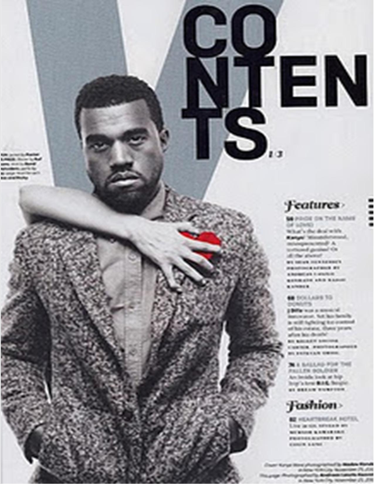
I changed the heading to be a the top of the page, this makes it clearer to read and stands out a lot ore. It gives a clear indication about who and what the article is going to be about. 


Monday, 22 December 2014

Contents page first draft

For my contents page I used the contents page from vibe further down my blog for inspiration. I have included similar features in mine as I liked the way in which the contents page had been set out, it was very simple however it was very effective. 
Vibe Contents Page:


My First Draft Contents Page: 

Again like with my cover image there are many things that I still need to change and edit with my cover in order to get it the way in which I want it. As you can see from first glance the size of my picture is to big so in order for it to work in my magazine I am going to need crop it down or add a border to it in order for it to be portrait. I have used Pixlr in order to add the writing onto my image however don't think the font that has been used for the word 'contents' stands out enough so need to look into finding other fonts. 

Editing My Contents Image

When editing my Contents Page I did it in a very similar way to my Cover image. Again I used iPhoto in order to edit these images. 
 I made the picture lighter, as the image was dark due to the time in which it had been taken.
Like done with the cover image I made the picture warmer as I want the same colour scheme to be used with the images. 
I then used the 'Retouch' feature to get rid of any blemishes my models may have had. 


Before Editing


After Editing

Saturday, 20 December 2014

Band Bio

The people that I have used for my magazine are a band called Romeo, Titus and Brian. I decided to call the band T. R. B so have just taken the first letter of each of there names. My cover is almost intelligent R and B as I have not gone for the typical hoodies and a urban back ground. So the name has also gone with the same as it doesn't include any symbols or aberrations like many band names and R and B artists do. 

Friday, 19 December 2014

First Draft

I have created my first draft of my music magazine cover however I can already see what is and isn't working about the cover. There are many different aspects of the cover that I am going to continue to edit and change until it is the way in which that I want it. 


As seen from my last post the picture that has been used was landscape, in order to over come this I have placed my image onto a white boarded which then makes it portrait. My colour scheme has been shown in the cover as it is black, white and red which is commonly used in many other magazines. However I am going to have to change where the writing that is on the image has been placed as it is not able to be read easily. The change may be to the font or the position in which is it on the cover. 

The fact that the band name has been put in bold makes it send out and draws the reader to it as it is in red however is not directly central. It does show how that is the name of the band and they are going to be the main feature of the issue. 

With the same at the bottom I have add a few names that are going to be included in the magazine, however I don't feel although the font goes with all of the others around it. I was also unsure if I should be using red or black as the colour however I did go with black as I am going to use red for any writing that is on the image itself. In the bottom right I have made a small statement as to why that band is on the cover however I don't think it fits in so will need to add in something more interesting. 

When creating the cover I need to ensure that I am using all of the conventions that are used in order to make up a magazine cover. 

Monday, 8 December 2014

Editing My First Image

The first thing that I did to my cover image was lighten it up, due to the time at which the pictures were taken it has already got dark. 


After increasing the lighting on my image I then make the picture warmer. I like the effect that this gives it the pictures as it is different from the usual. The tone of the picture complements the colours of everything that is in the background of the image. 


One of the last things I did to my image was to use the 'Retouch' on the editing software in order to get rid of any blemishes or imperfects that my models may have had. I only used this to even out there skin tone.  

I then need to crop the picture in order for it to fit onto the front cover. The fact that the picture has been made smaller without some of the background in draws more attention to the models as they are now the centre of the image.


Before Editing


After Editing 


I used iPhoto in order to edit these photos. 


Synergy and Techological Convergence

In order to ensure that magazines are not just able to be printed they are seen as a brand. This allows them to increase the amount of profits that they are going to be able to get as they will be able to publish the magazine in the way that is the most popular at the time. 

Synergy: 

This company own more than one brand, meaning they are able to take the profits from many different brands that they own. Due to the amount of technology we now have when looking at media there is a rang of different ways to do it. Due to many different platforms being used there is going to be different advertisements used on each of the different forms which leads to there being a larger audience. If a new film is produced there are many different advertising methods that are now used these are as follows:
  • YouTube Ads
  • Posters 
  • Tv Ads
  • Billboards  
The company will the use the name on as many things as possible like: 
  • Soundtracks
  • Cups
  • Clothing
Any merchandise that is going to have the brand symbolised on it.

Technological convergence:
This is about how we use a technological appliance for more than one thing. When we are using our smart phones now we are usually doing more than one thing at a time, when scrolling through twitter we would be listening to music and messaging people at the same time. When on laptops there is usually more than one tab open at a time as you would be doing multiple tasks. We use technology more and more as it becomes more and more up to date. Due to the ways in technology is evolving it is changing the way convergence occurs in music magazines.


Monday, 1 December 2014

First image


I have now taken my pictures for my magazine, above is the picture that I am going to be using for the cover page. As seen by all of the other magazines all of the artists have used direct eye contact, so I ensured that my models did the same. I like the way in which all of the back group has been slightly blurred out and the main focus is the fore ground. 

Like said in my plan when picking models you don't want to have people that look like they are camera shy. As shown in the picture the models look natural, the image does not look although it has been staged. The pose looks like it has just come natural to them and I have taken the picture. The confidence and attitude that has been shown in the image reflects the house style. The facial of all three models in the same, concentrated and serious. The angle at which the picture has been taken it at a slight angle, it is not directly in front of there faces it is slightly lower than that. 

My house style is R and B so stereotypically I should have taken my pictures in a Urban setting. However I have done it outside subverted this and taken my pictures outside. Going along with the same theme I have then ensured that my models were not wearing the stereotypical trakies and a massive hoodie. As my media teacher commented on the fact it looks like a ‘Updated’ style of R and B. 


My colour scheme is going to be red, white and black. Although the models are wearing all black I am going to make the writing the writing around them white and red. That is the one thing that I am using from the as inspiration from another magazine for the cover. 

Fifty quid man

This was created by a man called David Hepworth. The magazine 'The Word' was founded by David Hepworth, however during 2010 the magazine stopped being sold. The idea of the fifty quid man was due to the fact men used to go into shops and spend around £50 on music. However due to all of the technology that is now around this no longer occurs. I have always used technology for most things in life, as we are become to rely on technology more and more. Music now gets listened to on youtube, spotify and iTunes. It is no longer common for younger people to have CDs collections like people used to. New music is now purchased from things like the iTunes store rather than going into shops like HMV and buying the CDs. This is the same for what is occurring to the magazine industry, magazines are not starting to publish online rather than having paper copies as people are no longer purchasing them due to everything being done on technology. These factors have to be throughout about when creating my magazine. What I am going to have to include in order to make my magazine stand out from the rest. What is going to make people pick my magazine up when they can read others at the click of a button on their smart phone. Due to technology the ways in which we are now doing things is changing. 

Saturday, 29 November 2014

Risk assessment

While taking my pictures I have to ensure that my models safety is being kept in mind all of the time. As I am going to be taking my pictures outside there are a lot more safety factors that I need to be thinking about.

Due to it being winter there are a lot more hazards around. It is a lot colder now which may cause areas to be slippery and icy, so when walking around I will need to ensure that the areas that my pictures are going to be taken in are not icy which will prevent anyone from slipping over. The models will be wearing sensible footwear and clothing, that will keep them warm and from slipping over if there are any areas that are icy.

If it begins to rain I will have so stop the shoot due to area around us will be very muddy which will then become muddy. I will also have to stop as the camera will get wet if I proceeded to take the photos.

Due to being in the woods there are lots of things that could cause an injury, so while walking to the area where the photos are going to be taken I must ensure that no one is going to fall over anything that is on the floor. There may be broken glass or litter on the floor so that would want to be avoided as much as possible.

Friday, 28 November 2014

Planning my photos

I have decided to take my photos at a small woods near my house. I am hoping that there will be a small amount of sun with a light blue sky, however having it rain would be the worst weather situation. The fact of being outside shows how R an B is such a free genre type, and there are many different things that occur in the genre. If the pictures are too dark due to there being an over cast I will always be able to increase the lighting of them.

Finding my models:
I have decided to take pictures of three friends for my magazine. They also listen to R and B music and read different magazines of the genre so they know what type of image I am going to be looking for in order to put onto my magazine. When using some people that can become camera shy and not want certain pictures to be used, however the people that I am using do not mind what pictures that are used. They also will not be camera shy meaning that they will pose or not anything that I ask them to do.

How will I style my models:
As shown from my magazine deconstructions the typical colours that are used are white, red and black. So I have asked my models to wear black and red or white and red.

My models wont be using any props, there also wont be an props in the shot.  

Target Audience

When creating my magazine I have to keep my target audience in mind. Here is an example of a person that would read Urban Vibe on a monthly basis.
Titus is 18 years old and is into R and B music. Urban Vibe would be the ideal magazine for him as it will include all of the new up and coming artists that he would be interested in. The way in which Titus dresses in also influenced by his music tastes, like shown in the picture. Titus often goes to concerts in order to see his favourite artists perform. Due to Titus being able to drive he often has R and B on whilst driving. All of the factors above show the type of person that would be reading Urban Vibe on a monthly basis.  

Tuesday, 25 November 2014

Intertextuality

Intertextuality is the way in which a text is shaped in order to portray the meaning that it has. There are many different intertextual figures, these figures include: 
Allusion// Quotation// Calque// Plagiarism// Pastiche and Parody. 

The era that we are shown in today is the 'Post Modern Era' due to the fact that everything is starting to repeat itself. The things that are occurring now have already been done, or very similar things have been done. 

An example that was spoken about in one of my media lessons was Madonna and Lady GaGa. 

As you can see from the pictures above there has been two occasions where they have has similar outfits on. Showing that although we are getting new music, new artists and new fashion icons what has already been done will always be looked at. The new and upcoming artists will look back and what has already been done in order to get inspiration which is why the end up being so similar, they look back at what has been done due to the fact they can see what worked for the artist and why. Artists are also able to learn from the mistakes that occur in the past ensuring that they don't make the same mistakes themselves. 

Constructing an image: 
Before I take the pictures for my music magazine there are many different aspects of the image that need to be thought about. I will also have to think about how the image can be deconstructed and the different evaluative points that may be made about it. When images are created they will always have many different meanings behind them, there is more than what first meets the eye. This was shown by the cover the beetles did on a cover sleeve.

This image was very controversial and was actually stopped from being a cover sleeve and replaced with another image. Although this image was very controversial that was the main reason for the cover being created. Although this is controversial and would have drawn in a large audience sometimes things can be a bit too different, like we saw with David Carlson. He tried to do something that was so different however it didn't work as there was not many sales of the magazine. The covers are so different that they do not give any insight into what the topic of the magazine is about, which then starts to prevent people from purchasing it. 


Monday, 24 November 2014

Deconstructing Billboard Cover


One of the aspects of this cover that stands out the most is Rihanna's read hair. To someone that walks past this is one of the first things that they are going to notice. Rihanna has been used on the cover due to Billboard not being a magazine that is all about just want genre, it covers areas of R and B, Pop and Hip Hop so Rihanna is an appropriate individual to put onto the cover. This will also attract a large audience of readers to the magazine and purchasing it due to Rihanna fitting into more than one sector of music genres. There will be people that are interested in all three different genres purchasing the magazine. Like most magazine Rihanna is looking directly into the camera as it looks although she is giving the reader direct eye contact. The magazine have portrayed Rihanna as a very fierce and strong individual due to the colour red being used in many different aspects. The inside of the B has also been filled in red fitting in with the colours that have been used around the magazine. Another feature that has been used that is used in many popular magazines is the masthead being partly covered by the artists head. This is due to the magazine being so popular that even if only part of the name is seen the audience will still know what it is. 

The font that has been used is informal due to the magazine being aimed at teenagers, the colours that have been used in the letters are red and yellow. Which are natural and not aimed at one gender. Due to Rihanna being on the cover may attacked a male audience but also a female one due to her fans are mainly female. The feature headline is written in gradient affect due to the fact that the magazine is conveying the fact that her fans don't really know who she is, so this effect shows how the reader only knows about half of her life. The heading is also bigger than the masthead, which shows how Rihanna is more important than the magazine brand in itself. The quote "Don't know who I am" leaves the reader wondering what she has to say and how she is different to what they already know about her. Rihanna's biggest fans would want to purchase the magazine as they would want to know what they don't know about her and how she is different to what they see on TV and social media. It also gives the reader an insight as to what the magazine are going to be featuring about Rihanna. 


Wednesday, 19 November 2014

Deconstructing Vibe double page spread


This is a double page that has been used in Vibe magazine. There has been many different effects used in order to draw an audience in to read the article. 

When first looking at the double page, the first thing that is going to be seen is the blue and bold writing saying 'Solange Knowles' due to her being the main feature of the article. If people are unaware who she is this will then let them see who she is which may lead to them being interested about her causing them to purchase the magazine. 

Like I have said before the typical colours used in R and B magazines are red, black and white and those are three colours that have been used once again. The dress being red may symbolise many different things, the dominance that Solange has as an artist, it may also be showing connotations of danger. Due to everything else being in black and whet apart from the dress it makes it stand out even more, showing the importance that Solange as to the article. Although Solange is shown to be very serious and diva like in the main picture there is many pictures along the top of the article that shows her not taking herself to seriously. These picture denote how she is a fun person as the pictures are not her in doing many different poses but her just 'messing around'. 

Although there is large amounts of text there is also a bold paragraph which would be summarising what the article is about meaning that people who don't want to have to read the whole article will still be able to understand what the article has said. This would have been the most interesting quote or part of the story and the bold bit is normally read by the reader before the main article, so it needs to be interesting in order for the reader to want to read the whole article. Due to the article having such a small font it allows more information to all fit on one page, this will draw in many of Solange's fans and they will be able to read a large amount about her in one article. 


Monday, 17 November 2014

Deconstructing Vibe Contents page

 This contents page is simple just like the cover of XXL magazine was. There is a V in the background in order to represent the brand of the magazine even though it is the contents page, even though only a V has been used and not the whole name of the magazine the audience will still know what the magazine name is due to the popularity is. 

The word 'contents' has been put in a bold and striking font in order for it to stand out the most. The fact that it has been set out over three lines shows how the style of the magazine is different to just what is typically done, this adds to the fact of how Vibe are trying to be different. You know what the word is going to be however as people look at it they almost have to thing about what they are reading due to it being placed on three lines7. 

Again like XXL used on there cover the colours are very simple however here there has been a slight use of red. In general the colour red symbolises many different things, like danger or love. However due to the fact that the red is near his heart it may be giving connotations of love, this love is coming from a woman as shown by the fact that there is a woman hand across him on top of the red. This could be linking recent life events or what his next song is going to be about. This would make people want to purchase the magazine due to the grey colour that has been used makes the page look very mysterious, Kanye's face is also like a blank page. No emotion is being shown, although he does look more sad than happy, his facial expression almost looks distressed which may be due to the 'love' that is in his life. The hand almost looks as though it is pulling the love away which may also be occurring in his life. Due to Kanye being a massive iconic figure in R and B music him being featured in the magazine will attract a large audience of people, whom of which are his fans, due to his popularity. As well as being a music magazine Vibe also included features of fashion so Kanye is shown well dressed, he looks although he is smart causal due to the blazer. However due to him having his hands in his pockets it makes it seem more casual as this also makes creases in the arms and the pocket area. 

Like all magazines do it order to draw the reader in the magazine have used direct eye contact, so Kanye is looking directly into the camera. So as the reader picks up the magazine they are going to have eye contact with the image. 

At the side in a lot smaller print that the word 'contents' was in there is a list of what the magazine includes. It is clear that vibe wanted to make Kanye the most dominant thing on the page as the rest of the writing on the page is in the bottom right hand corner. In order to the rest of the headlines as interesting as possible there have been any different fonts used, however Vibe have kept "Features" and "Fashion" have been written in the same font, They both look formal and are well presented. Although the writing as been placed in the bottom right hand corner they are easy to read and highlight all of the main topics that the magazine is going to include. The page numbers are also in bold which makes them stand out more, allowing the reader to get to all of the different stories easily. 

Deconstructing XXL Cover


This cover of XXL magazine is showing features that are typical of R and B// Hip hop magazines. The colours red, white and black are the three dominant colours that are used for most magazines and they have once again been used on this cover. The two artists are wearing black and white with the colour red being added into the text. With my magazine being an R and B magazine I am looking to do the same with the colours that I am going to use. People may not have seen all of the magazine and just the colours they would know that the genre of the magazine is going to be R and B// Hip-Hop due to these colours being associated which those genres of music. The fact that the word 'Domination' has been put in read when all of the other words are in white buts extra emphasis on that words it has also been put into block capitals. The use of this word being emphasised shows how the magazine is going to include large articles of both of the artists, which allows the audience to see what the main topic of the magazine will be without them having to pick it up and look inside. 

The fact that the artists head has covered part of the 'XXL' logo conveys the fact the magazine are so confident in how popular they are that people do not need to see what the whole name of the magazine is, even when only half of it is seen they will still know what magazine it is. 

Both of the artists are giving direct eye contact into the camera which is used as effect in order to make it look like they are looking directly at the reader. Nicki is being shown in a slightly different light in this cover, as normally she is shown wearing more revealing cloths however here is shown more covered up the usual which would make people pick up the magazine as the reason why may be explained inside. Drake is wearing simple clothing with only one chain around his neck, which is also not what is normal for artists that are on the cover of the magazine as they are known to have there tops off with heavy gold chains. 

The cover is simple as it has not been overloaded with many different headlines like some covers do. There is one main cover line with a few other headline in the righthand corner. Which would be more appealing with people that are older as they do not need bright colours and lots going on in one space in order to want to pick up the magazine. The fact the the magazine has said 'The Rebirth of Rap Royalty' shows that the magazine is going to include many different features of Rap and where it is not going due to it being in a stage of "Rebirth". Also due to the fact that the headline is about Nicki and Drake is allows the reader to see how they are now the new generation of 'Rap Royalty'.