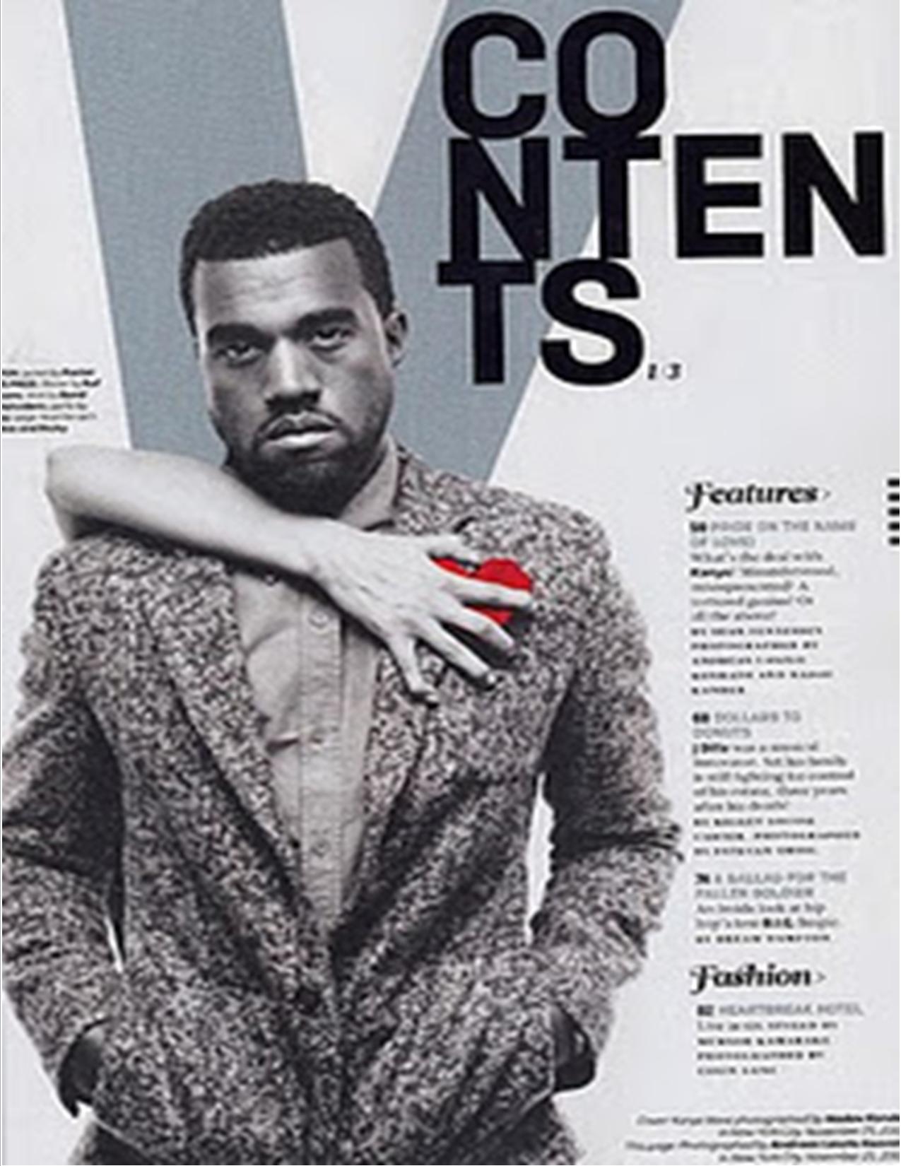
 This contents page is simple just like the cover of XXL magazine was. There is a V in the background in order to represent the brand of the magazine even though it is the contents page, even though only a V has been used and not the whole name of the magazine the audience will still know what the magazine name is due to the popularity is.
 The word 'contents' has been put in a bold and striking font in order for it to stand out the most. The fact that it has been set out over three lines shows how the style of the magazine is different to just what is typically done, this adds to the fact of how Vibe are trying to be different. You know what the word is going to be however as people look at it they almost have to thing about what they are reading due to it being placed on three lines7.
Again like XXL used on there cover the colours are very simple however here there has been a slight use of red. In general the colour red symbolises many different things, like danger or love. However due to the fact that the red is near his heart it may be giving connotations of love, this love is coming from a woman as shown by the fact that there is a woman hand across him on top of the red. This could be linking recent life events or what his next song is going to be about. This would make people want to purchase the magazine due to the grey colour that has been used makes the page look very mysterious, Kanye's face is also like a blank page. No emotion is being shown, although he does look more sad than happy, his facial expression almost looks distressed which may be due to the 'love' that is in his life. The hand almost looks as though it is pulling the love away which may also be occurring in his life. Due to Kanye being a massive iconic figure in R and B music him being featured in the magazine will attract a large audience of people, whom of which are his fans, due to his popularity. As well as being a music magazine Vibe also included features of fashion so Kanye is shown well dressed, he looks although he is smart causal due to the blazer. However due to him having his hands in his pockets it makes it seem more casual as this also makes creases in the arms and the pocket area.
Like all magazines do it order to draw the reader in the magazine have used direct eye contact, so Kanye is looking directly into the camera. So as the reader picks up the magazine they are going to have eye contact with the image.
At the side in a lot smaller print that the word 'contents' was in there is a list of what the magazine includes. It is clear that vibe wanted to make Kanye the most dominant thing on the page as the rest of the writing on the page is in the bottom right hand corner. In order to the rest of the headlines as interesting as possible there have been any different fonts used, however Vibe have kept "Features" and "Fashion" have been written in the same font, They both look formal and are well presented. Although the writing as been placed in the bottom right hand corner they are easy to read and highlight all of the main topics that the magazine is going to include. The page numbers are also in bold which makes them stand out more, allowing the reader to get to all of the different stories easily.
No comments:
Post a Comment